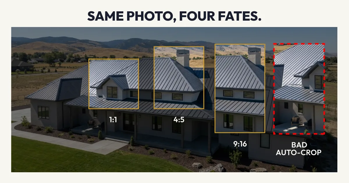
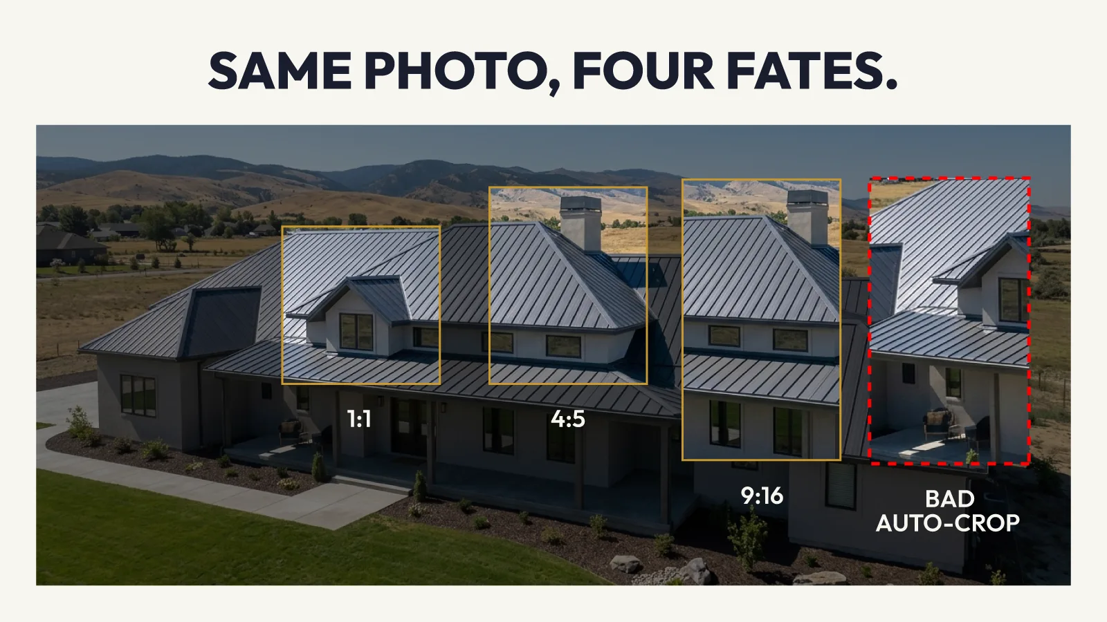
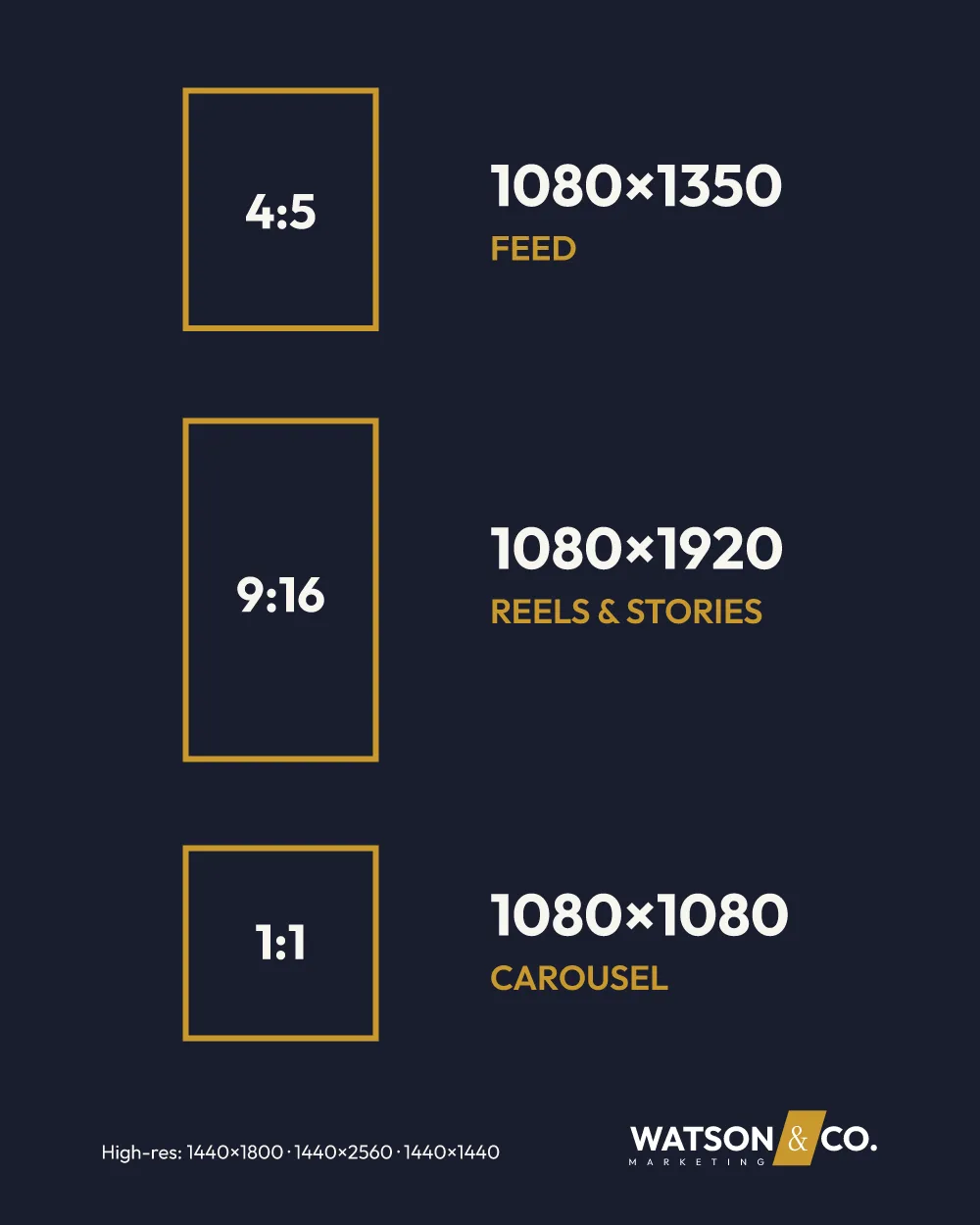
Three sizes handle 95% of contractor Facebook ads: 1:1 (1080 x 1080) for carousel and Marketplace, 4:5 (1080 x 1350) for Feed, and 9:16 (1080 x 1920) for Reels and Stories. The 4:5 ratio takes up the most screen on mobile and is the best default for before/after job photos. All three can be cropped from a single vertical shot taken on site.
You took a good photo on the job. The roof looks clean. The tree is down. The before/after is obvious. You upload it to Facebook, hit publish, and Meta crops the top of the "before" right out of the frame. Or the phone number you burned into the image gets buried under the caption bar. The ad runs for a week. Low engagement, no calls.
That's not a creative problem. It's a sizing problem. Facebook runs your ad across Feed, Stories, Reels, Marketplace, and the Audience Network. Each placement crops differently. If you upload one image and let Meta figure it out, Meta will figure it out badly.
This guide covers the three sizes that matter for home services ads on Meta, how to format before/after photos so they survive every placement, where your phone number and offer text need to sit, and a field-ready workflow for getting job site photos ad-ready without a designer.
Still deciding whether the spend is worth it? Our breakdown of what actually works for home service companies on Facebook covers CPL benchmarks and Advantage+ tactics before you get to sizing.
The Three Sizes That Matter
Every Meta ad placement maps to one of these three ratios. There are dozens of placements across Facebook, Instagram, Messenger, and the Audience Network. You don't need to think about all of them. You need these three sizes, and Meta handles the rest.
| Ratio | Pixels | Where It Shows | Best Contractor Use |
|---|---|---|---|
| 1:1 | 1080 x 1080 | Carousel, Marketplace, right column | Before/after carousel cards, review screenshots |
| 4:5 | 1080 x 1350 | Feed (mobile) | Single-image ads, stacked before/after, offer posts |
| 9:16 | 1080 x 1920 | Reels, Stories | Video walkthroughs, full-screen promos, vertical job photos |
4:5 is your default. It takes up 25% more screen space than a square on mobile Feed, which is where 90%+ of home services audiences scroll. More screen means more attention, more time on your ad, and higher click rates. If you only make one version of an image, make it 4:5.
9:16 is the move for Reels. Reels is Meta's fastest-growing placement and where CPMs run lowest. A vertical video or full-screen static image at 1080 x 1920 fills the entire phone. For contractors, this is the format for walkthroughs, time-lapses, and team shots. Horizontal job photos get letterboxed with black bars. That looks amateur. Shoot vertical.
1:1 is for carousels and Marketplace. Square works when you're running a multi-card carousel: before photo, after photo, review screenshot, offer card. Each card at 1080 x 1080 sits cleanly in the swipeable format. It also works on Facebook Marketplace, where home services ads increasingly surface.
Before/After Photos: The Right Way to Format Them
Before/after is the single most effective ad format for contractors on Facebook. Homeowners want proof. A roof that went from tarped to finished. A yard that went from overgrown to manicured. A drain that went from backed up to flowing. Before/after delivers that proof in one glance.
The problem isn't the concept. The problem is the layout.
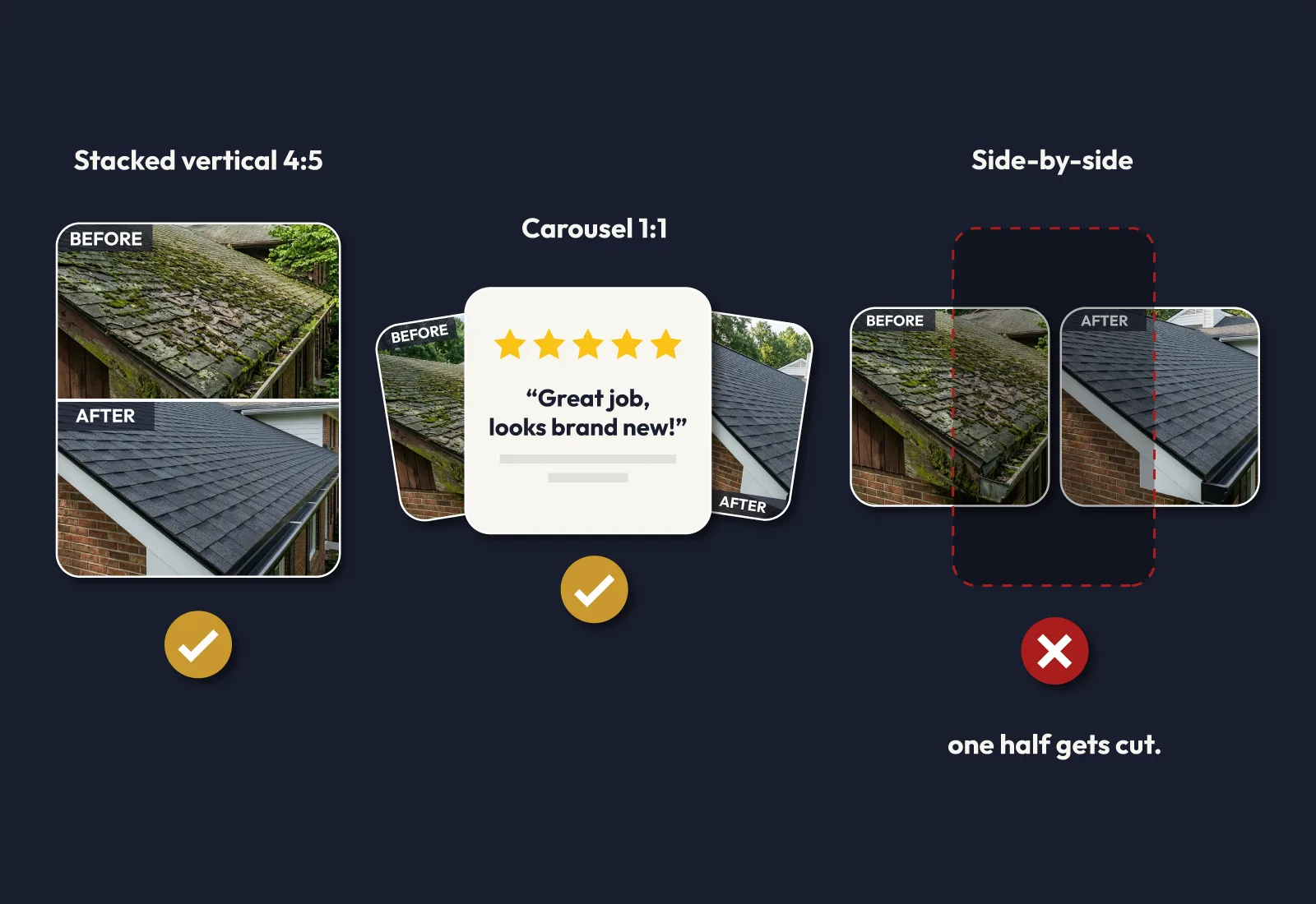
Stacked Vertical (4:5): The Safe Choice
"Before" on top, "after" on the bottom. Both halves survive every crop Facebook applies. The image holds up in Feed, Stories (with minor trimming at the extremes), and even in small preview thumbnails. If you're running a single-image ad, stack vertically and use the 4:5 ratio.
Carousel (1:1): The High Performer
Card 1: before photo. Card 2: after photo. Card 3: five-star review or offer. Each card is a clean 1080 x 1080 square. No cropping risk. The swipe mechanic creates engagement. This format consistently outperforms single-image before/after for HVAC installs, bathroom remodels, and tree removals because the reveal happens on the homeowner's action, not in a static split.
Side-by-Side Square (1:1): The One That Breaks
Splitting a 1:1 image in half with "before" on the left and "after" on the right is the most common mistake I see. It looks fine in Feed. But when Facebook runs it in Stories or Reels at 9:16, the crop cuts the "after" shot in half. You paid for a click and the homeowner saw a broken layout. Don't do this unless you're also uploading a separate 9:16 version.
Safe Zones: Where Your Phone Number Actually Shows Up
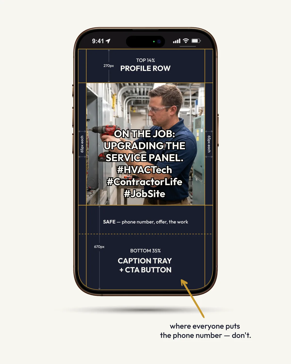
Every Reels and Stories placement covers part of your image with Meta's UI: profile icon, caption text, CTA button, like/comment/share icons. If your phone number, logo, or key text sits in those zones, it's invisible.
The 2026 unified safe zone for Meta vertical placements:
- Top: Keep the top 14% clear. Meta's account name and timestamp overlay sit here.
- Bottom: Keep the bottom 35% clear. The caption bar, CTA button, and engagement icons cover this area.
- Sides: Keep 6% margins on left and right. Rounded screen corners and edge overlays clip content here.
In practical terms: if you burn your phone number into the bottom third of a 9:16 image, nobody will see it. Meta's caption bar covers it completely. If your tech's face is in the top-left corner of a Story, the profile avatar covers it.
The center 50% of a vertical image is your safe zone. That's where the work goes. The finished install. The clean gutters. The trimmed canopy. Phone numbers and offer text go in the middle third, not the edges.
For 4:5 Feed ads, the safe zone is less restrictive because Meta doesn't overlay UI on Feed images. But if you're running Advantage+ placements (and you should be), your 4:5 creative will also run in Stories and Reels, where the safe zone applies. Design for the strictest placement and everything else looks fine.
The Job-Site-to-Ad Workflow
Most contractors shoot photos horizontally. That's the instinct: hold the phone sideways like a camera. For ad creative, this costs you the two highest-performing placements (Reels and Stories) right out of the gate.
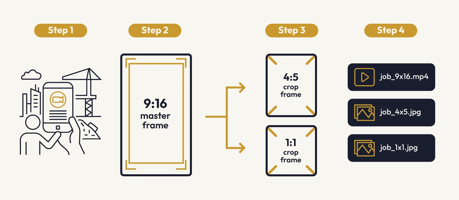
Here's the workflow that makes every job photo ad-ready:
Step 1: Shoot vertical on site. Hold the phone upright. Capture the full scene at 9:16. Wider shots work better than tight crops because you can always crop in, but you can't crop out.
Step 2: Export the 9:16 master. This is your Reels and Stories asset. 1080 x 1920 pixels minimum. 1440 x 2560 is better if your phone shoots at higher resolution.
Step 3: Crop to 4:5 and 1:1. From the same vertical shot, crop a 4:5 version (1080 x 1350) for Feed and a 1:1 version (1080 x 1080) for carousel cards. Center the crop on the most important part of the image.
Step 4: Name the files. Use a consistent naming convention: roof-replacement-smith-4x5.webp, roof-replacement-smith-9x16.webp, roof-replacement-smith-1x1.webp. Your ads manager (or you) should never have to guess which file is which.
One vertical shot on site gives you three ad-ready files. No reshoots. No separate photo sessions. No designer needed.
Export Specs for Your Designer (or Yourself)
Keep these numbers somewhere your team can reference. Print them. Screenshot them. Pin them in your group chat. These are the specs that keep Meta from rejecting or degrading your creative.
Format: PNG or JPEG. PNG is better for graphics with text overlays. JPEG is fine for job photos. WebP works too.
File size: Under 30MB. In practice, keep images under 5MB for faster upload and processing.
High-res dimensions (recommended):
| Ratio | Minimum | Recommended | Use |
|---|---|---|---|
| 4:5 | 1080 x 1350 | 1440 x 1800 | Feed ads |
| 9:16 | 1080 x 1920 | 1440 x 2560 | Reels, Stories |
| 1:1 | 1080 x 1080 | 1440 x 1440 | Carousel, Marketplace |
Text rules: No critical text in the top 14%, bottom 35%, or side 6% margins. Logo on every creative. Phone number in the center third, not the edges.
File naming: [job-type]-[client-or-location]-[ratio].ext. Example: hvac-install-johnson-4x5.jpg.
The Placement Table
Here's every major Meta placement mapped to recommended size and contractor use case:
| Placement | Recommended Size | Notes for Contractors |
|---|---|---|
| Facebook Feed (mobile) | 4:5 (1080 x 1350) | Your highest-traffic placement. Before/after, offers, testimonials. |
| Facebook Feed (desktop) | 1:1 or 4:5 | Desktop users see the full image. Either ratio works. |
| Instagram Feed | 4:5 (1080 x 1350) | Same as Facebook Feed. Visual quality matters more here. |
| Facebook/Instagram Reels | 9:16 (1080 x 1920) | Vertical video or static. Lowest CPMs. Job walkthroughs. |
| Facebook/Instagram Stories | 9:16 (1080 x 1920) | Full-screen. Great for limited-time offers. |
| Carousel (any placement) | 1:1 (1080 x 1080) | Before/after/review card sequences. |
| Facebook Marketplace | 1:1 (1080 x 1080) | Home services ads are increasingly surfacing here. |
| Audience Network | 4:5 or 1:1 | Auto-placed by Meta. Use your Feed creative. |
| Messenger Inbox | 1:1 (1080 x 1080) | Small preview. Clean, simple images only. |
If you're using Advantage+ placements (recommended), Meta serves your ads across all of these. Upload assets in all three ratios and let the algorithm deliver the right one to each placement. If you only upload one size, Facebook will auto-crop, and auto-crop does not care about your "after" photo.
The 4:5 default argument is simple math: mobile Feed is where home services audiences spend the most time, and 4:5 takes up 25% more screen than 1:1 on a phone. More screen, more attention, more clicks. Start every campaign with a 4:5 primary image, add 9:16 for Reels, and 1:1 for carousel.
Why This Keeps Going Wrong (And How Agencies Miss It)
When you upload a single image to Meta Ads Manager, the platform asks for a 1:1 crop. Most contractors (and plenty of agencies) stop there. One square image, shipped to every placement, auto-cropped by Facebook's algorithm.
The result: your job photo shows up letterboxed in Reels with black bars on top and bottom. Your before/after gets chopped in Stories. Your phone number disappears under the caption bar. The ad runs, the metrics look bad, and everyone blames the creative.
It's not the creative. It's the sizing. Generalist agencies that run ads for dentists, restaurants, and e-commerce alongside your plumbing company don't catch this because they're not thinking about how a job site photo behaves across placements. They upload the image, check the preview, and move on. The preview shows Feed. Feed is one of eight placements your ad runs on.
Agencies that specialize in home services advertising build every campaign with three asset sizes from day one. We shoot or request vertical, crop down, and test placement-specific creative because we know what a roofing photo looks like when Facebook auto-crops it to 9:16. It looks bad.
Want to know if your current ads are sized correctly and what you're leaving on the table? We'll pull your creative, check every placement, and show you what to fix.
Get Your Free Growth AuditSizes Are the Starting Line
Getting the ratios right means your ads stop getting cropped, your phone number stays visible, and your before/after photos look the way you intended. That alone will improve your click-through rate and lower your cost per lead.
But the contractors who fill their schedules with Meta ads know that sizing is just the starting point. The creative has to match how homeowners actually decide: before/after proof, fast response, local trust signals, and a clear call to action. Watson & Co. builds campaigns for one home services company per trade, per market. No exceptions. Your competitor in your trade will never hire us against you. If your market is still open, get your free growth audit and we'll show you exactly what's costing you calls.
Frequently Asked Questions About Facebook Ad Sizes for Contractors
What size should I use for Facebook ads as a contractor?
Use 4:5 (1080 x 1350) as your default for Feed ads. Add 9:16 (1080 x 1920) for Reels and Stories, and 1:1 (1080 x 1080) for carousel cards and Marketplace. Upload all three sizes so Meta serves the right version to each placement without auto-cropping your job photos.
Why do my Facebook ads look cropped or zoomed in?
Facebook auto-crops your image to fit each placement. If you upload one size, the algorithm stretches or clips it for Reels, Stories, Marketplace, and Feed. Upload assets in all three ratios (1:1, 4:5, 9:16) and Facebook uses each one correctly instead of guessing.
Can I use before/after photos in Facebook ads?
Yes. Before/after photos are allowed and are the highest-performing ad format for contractors. Use a stacked vertical layout (4:5) or a carousel (before card, after card, review card in 1:1). Avoid side-by-side splits in a square because the 9:16 crop cuts the "after" half in Reels and Stories.
Where should I put text on my Facebook ad images?
Keep all critical text (phone number, offer, logo) in the center third of the image. For Reels and Stories, the top 14% and bottom 35% are covered by Meta's UI overlays. Text in those zones is invisible. The sides have a 6% margin from edge overlays and rounded screen corners.
What image file size does Facebook accept for ads?
Facebook accepts images up to 30MB. For best results, keep files under 5MB. Use JPEG for job photos and PNG for graphics with text overlays. Recommended resolution is 1440 x 1800 for 4:5, 1440 x 2560 for 9:16, and 1440 x 1440 for 1:1.